
Reinventing the booking experience
A seamless booking experience enabling high customer conversion and retention.
The problem landscape
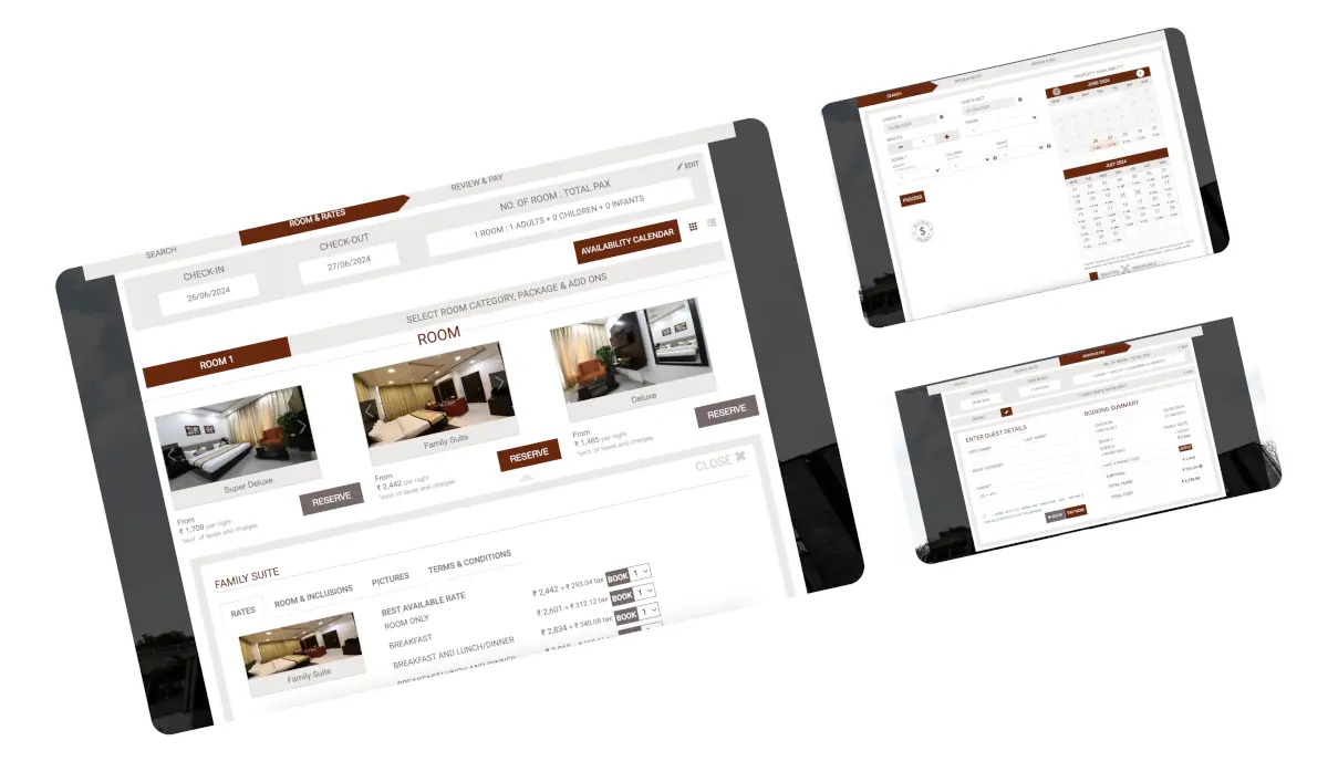
The state of the old product
The existing booking engine was losing customers before they ever reached a confirmation screen. Six problems kept surfacing.
Objective
Find out why customers were dropping — then fix it
The aim was to find the reason for customer drop rates and craft an experience that promotes quick conversions and a better booking experience for end customers.
Find the root cause
Conduct a UX and behavioural audit to understand consumer behaviour through user research, analytics and past data.
UX & product strategy
Craft a better UX and product strategy that promotes loyalty and conversions by revisiting and redesigning the information architecture and workflows to be fast, effective and usable.
Craft delightful design
Craft a delightful booking experience for customers with a fresh look and feel.
The solution
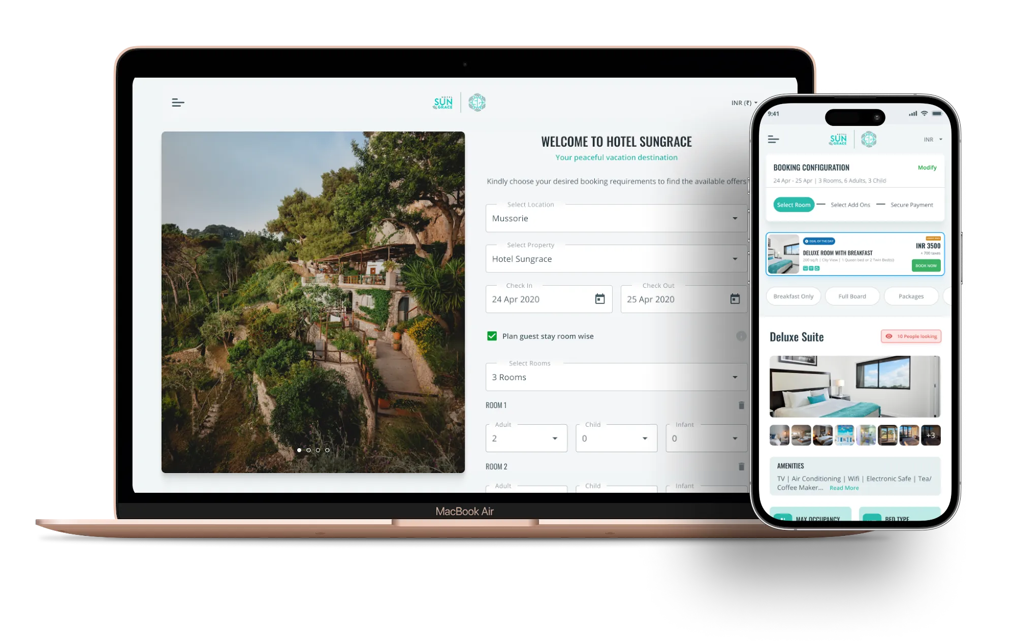
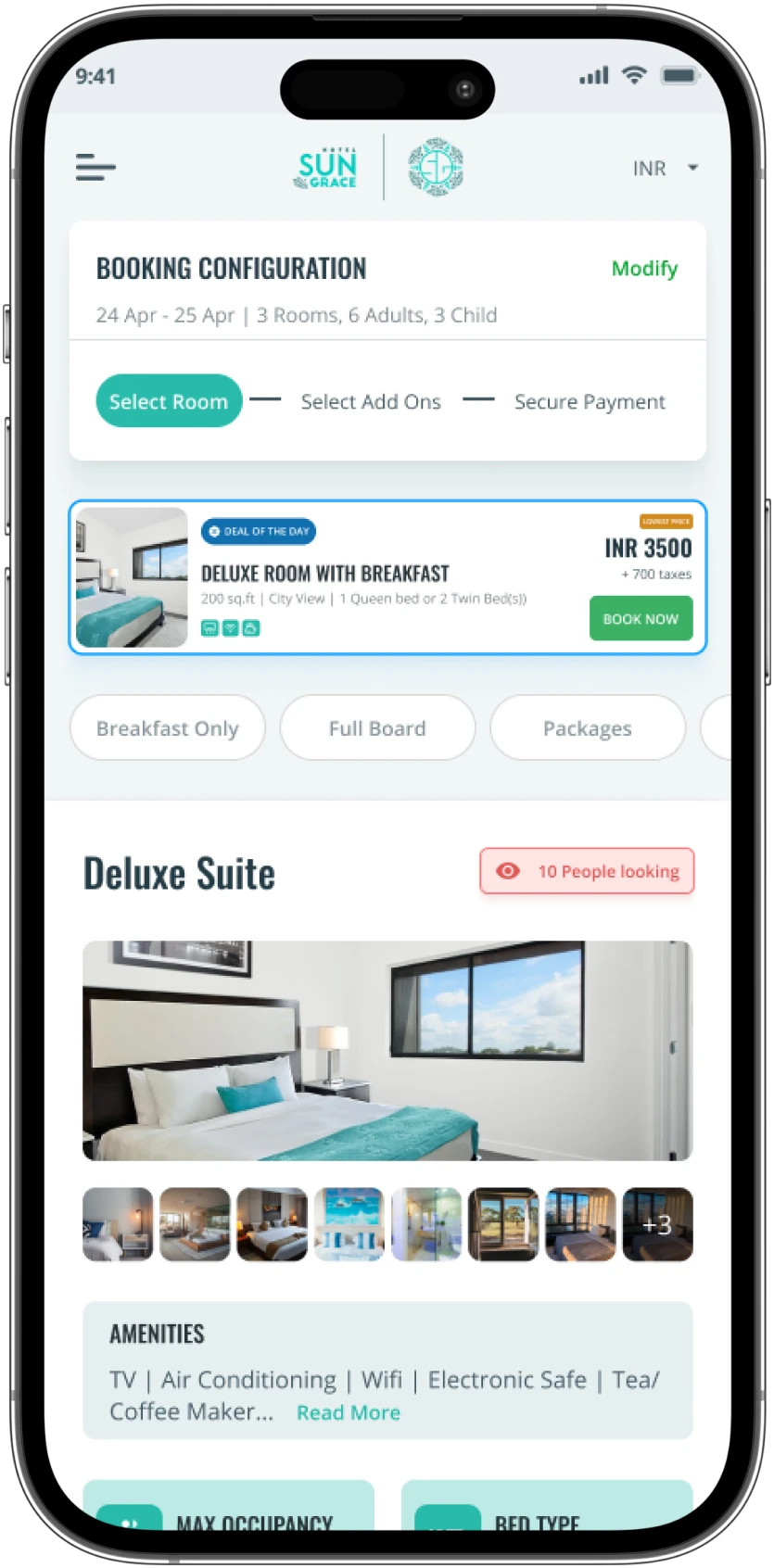
Almost 60% of customer traffic came through mobile devices. So the rebuild went mobile-first.
Crafting a mobile experience that transitions easily to web, and helps a guest book a room and find suitable hotel deals in the fastest, most convenient way.
Minimal time
Ensure the process is as short as possible.
Intuitive
Ensure the design is familiar and quick to understand.
Delightful
Subtle colours and design that enhance the experience.
Usable
Ensure the solution is usable, with the right affordance.
The approach
Data first, emotion second — both necessary
We started by understanding the problem statement and using a data-driven approach to dive deep into customer behaviour, keeping business goals in mind. Crafting a B2C product experience needs a more emotional, engaging and intuitive approach to design for quick conversions.
Data-driven deep dive
Extensive data and consumer journey analysis to map the existing journey and workflows. UX audit and heuristic evaluation of the existing platform.
Brainstorming innovation
Collaborative brainstorming sessions. Through blue-sky thinking we explored possibilities and identified user wants beyond immediate needs.
Designing for delight
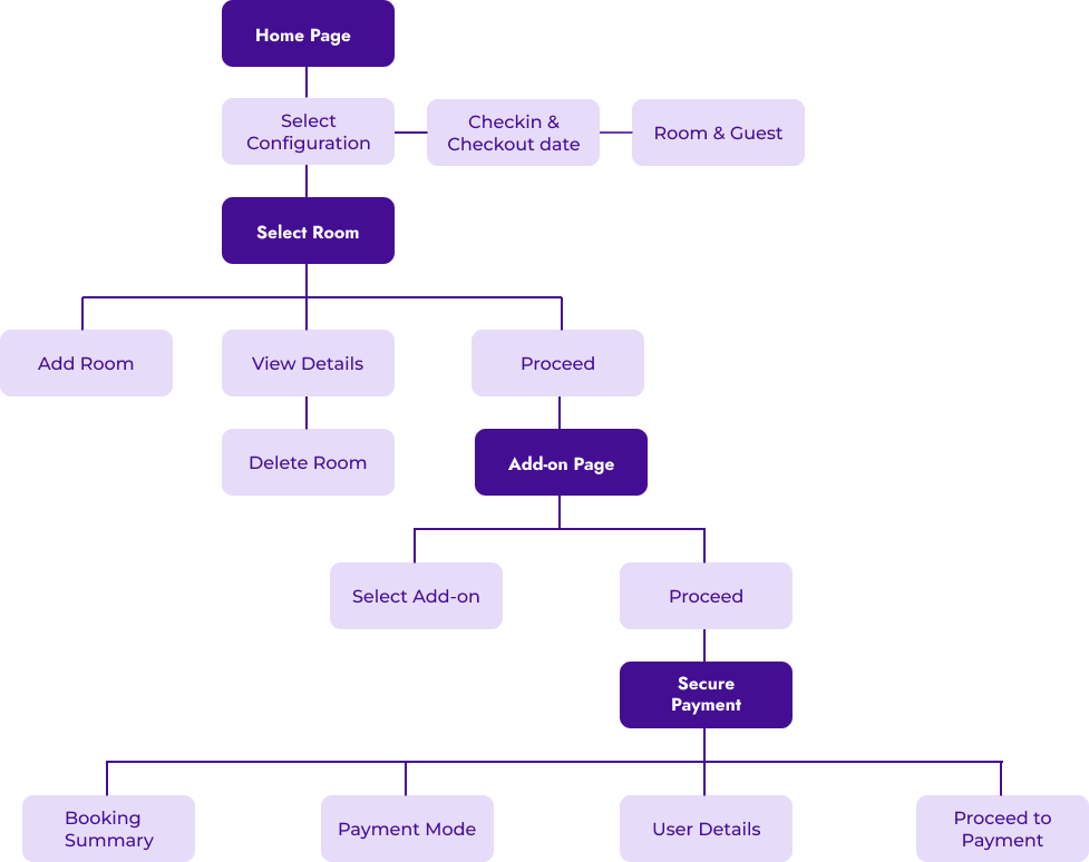
We crafted the solution's information architecture for a user-friendly layout, followed by initial wireframes and a high-fidelity UX prototype.
Refining the experience
Rigorous usability testing identified potential roadblocks and refined the design for ease of use and customer satisfaction.
Deliverables
What was handed over
Application architecture
The structure the interface was rebuilt on.
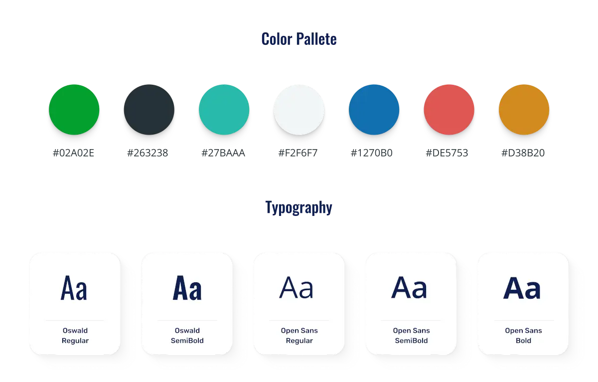
Aesthetics & guidelines
Look, feel and the rules to keep it consistent.
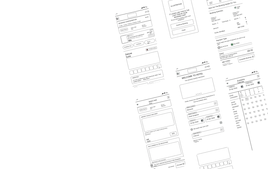
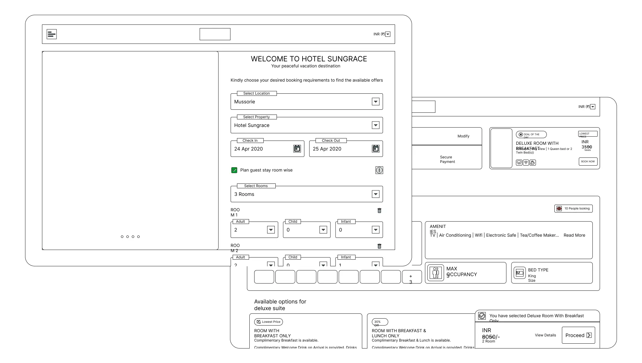
Low-fidelity wireframes
Testing the concept at wireframe level reduced iterations and rework on the finalised concept.
Imagery from the original case study.
Got a flow that leaks?
The studio takes on a small number of engagements a year, and answers one specific problem a day through Quick Recommendations.